
Posted by Brian McCullough
 You’ve no doubt heard the old saw that your resume only has “X number of seconds” to catch a reader’s eye.
Part of the problem is, most people just use the same dull resume templates found in Word… or whatever your word processing program is.
A well-designed resume is eye-catching and professional-looking. You’ll know at a glance that a well-designed resume is no off-the-shelf template. The information on the resume is organized in a clean, easy-to-read way that emphasizes important information at a glance. A good design uses basic concepts of typography and layout design to present your information in a dynamic way.
Whether or not your resume sells your skills effectively to the reader depends on how well it’s written. But if you’re just concerned with resume design, there are 4 quick things you can incorporate that are guaranteed to make your resume look better then most of the others you are competing with.
I’m going to show you how to use varied text, bulleted lists, columns and horizontal lines to organize your information effectively and, most importantly, stand out.
Bold, Underlined Or Different Sized Text
This one is simple. Your resume should be the same font throughout the entire resume. But you can and should vary the text for section headers and other items.
For example, let’s say you’ve selected Times New Roman for your resume. That’s fine. It’s easily readable to both humans and machines and looks professional. I’d recommend 11 or 12 point font sized for most of the text.
- But let’s say for your name at the top of the resume, you use 18 point and bolded.
- For your contact information under that, you choose 14 point, not bolded.
- For every section heading of your resume (Objective, Qualification Summary, Employment History, Education, etc.) you chose 14pt bolded and underlined.
- For each company name in your career history, you keep the normal text size (11 or 12 point) but you bold and underline.
- For the name of your position at each job, you bold but do not underline.
These are just examples. You could also try writing some header sections in all caps.
The idea behind all of this is simply to break up the monotony of the text by highlighting important info. Your eye is very good at catching patterns, so if the reader can at a glance see that everything that is bolded and underlined is the name of a past employer, then it’s easy to organize that information at a glance.
The key point to remember is to remain consistent. If you make one section heading 14 point, make sure they all are. And don’t go crazy and have dozens of different text sizes and types. Just a handful of variations helping to organize the information is fine.
Bulleted Lists
I’ve mentioned before that a key to writing an effective resume is to “show not tell.”
A quick and effective way to do this is to use bulleted lists in your employment history.
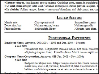
 Look at the image to the left.
My recommendation is to use a normal paragraph form to describe your previous position and your duties in however many sentences is appropriate.
Then… below the paragraph describing each position, list your most important accomplishments, awards, etc. in bullet form. You know, things like, “Increased sales 24% division-wide.”
Do this for each job. The paragraph section describes the job, your responsibilities and the outline of your experience. And then below the paragraph section you have a bulleted list highlighting key accomplishments and data points from that job.
Note: some people go crazy with bullets on a resume. They turn each new idea or sentence into a bullet until the entire resume is one long bulleted list. I hate that.
Use to bullets to emphasize important information only. If you make everything a bullet, then the bullets lose all power to highlight or emphasize. Save your bullets for information you want to stand out.
Columns
 Columns are a good way to organize lists of information. For example, if you have a set of skills or certifications, instead of one long list of only one or two word items each (leaving lots of whitespace down the page) try organizing the information using columns.
If you have a word processing program that can utilize tables and other page design elements, you can quickly set up rows of columns.
An easy way to do this same thing using only the keyboard is to just use the TAB button like you used to on a typewriter. Tab the words over until they line up in nice, even columns.
Horizontal Lines
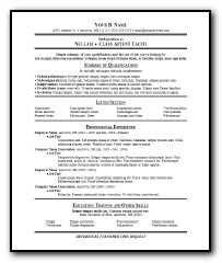
The best, quickest way to make a clear delineation between bits of information is to use horizontal lines. Take a look at the sample resume picture at the very top of this post. Even though the image is so small you can’t make out the typing, the horizontal lines make it easy to see the different sections of the resume.
Again, don’t go overboard with the horizontal lines. At most, use small, thin lines to separate each section of your resume as in the design above.
More commonly, I’d simply use horizontal lines at the top (to separate your name and contact info from the rest of the resume) and at the bottom, as a kind of content footer.
Some people even get super fancy and use lines to create boxes around their resumes, but I don’t recommend this for most resumes.
If you want a quick way to make different kinds of horizontal lines, you can use some simple keyboard shortcuts which are built into Word. For example, you can create a quick double line by typing in three equal signs right in a row and then hitting enter.

In Conclusion
Using the simple typographical and graphical elements listed above, you accomplish two things at once. First, you organize the information on your resume in a way that makes it easy for the eye to sort through at a glance. Second, you’re giving your resume an eye-catching design that is a cut above of what most people are capable of producing. Your resume will stand out visually, and it will be easy for you to highlight pertinent information that might catch a recruiter’s eye.
P.S. You can see some good sample resume designs we’ve done on the ResumeWriters.com sample resumes page.
Related posts:
