TheJobBored.com

The Job Search And Career Advice Blog

TheJobBored.com header image 2


What Font Should I Use For My Resume?

July 17th, 2009 · 17 Comments

Posted by

resume_fontsHere’s a very basic resume writing question: What font should you use for your resume?

It’s not an insignificant issue.

First of all, you want your resume to be legible. And you want your resume to be legible (easily readable) not just for human eyes, but also for computer eyes… in case your resume might be scanned into a database. You want your resume to be legible if faxed, scanned, transmitted, emailed as a photo attachment, etc.

But secondly, and just as important, the font you chose can communicate a lot about your professionalism and intentions. If you’re an accountant, you want to stick with normal, conventional “professional” fonts. But if you’re a graphic designer, you want to and probably need to be a little more adventurous in your font choice.

So what are the fonts I would recommend using for most professions in most cases?

Your choices are basically between traditional serif fonts (Times New Roman) and sans serif fonts (Arial, Helvetica, etc). Here are the fonts I’d feel most comfortable using:

Times New Roman-

I’d say this is the safest bet for most people. It’s the most common professional font for a reason. It’s highly legible and professional looking. The downside: you risk looking just like everyone else.

Century Old Style-

A good font to use for very traditional or “stuffy” jobs.

Verdana-

Arial-

Veranda and Arial are both excellent Helvetica substitutes. Highly legible and familiar to most people.

Tahoma-

Another common and legible choice.

Courier New-

An excellent and very common font, but I find that it looks too much like an old type writer font (which it’s intended to do) and… this is just a personal preference… I feel like that makes a resume look a bit dated.

Here’s a list of fonts I found on a resume template website. This is a good list that I’d stick to pretty much exclusively.
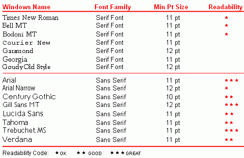
best-resume-fonts

In the end, resume font choice can be a personal decision. Go with what looks best and makes you feel the most confident and professional. But don’t go too far afield. Unusual or showy fonts can make your resume stand out in a bad way.

And of course, if you need some resume help with your resume writing, you know where to go. :)

Related posts:

  1. Resume Tip- 4 Quick Ways To Make Your Resume Stand Out
  2. Resume Help
  3. What To Do If You Just Can’t Fill A Resume
  4. Resume Help – Why It’s Necessary, And Where To Get It
  5. Ask Brian- Taking A Step “Backward” And How To Address This In My Resume
  6. Ask Brian – What is the Difference Between a CV and a Resume?

Tags: resume help · Resumes

  • Elliot

    Times New Roman is a universally default font – it shows a lack of care and attention to detail. It’s also the second most hated font of all time, just barely behind Comic Sans.

  • Brian

    Or, there’s this, from the Onion: http://www.theonion.com/content/node/52073

    • http://profiles.yahoo.com/u/C2PPUEJUPUF6JMMBFLJTIM5KQE Jeff H

      Anyone who reads the onion is a fool.

  • Ryder

    Elliot, you are a fool. Anyone with a sense of style loves comic sans, Times New Roman being the default font around the world means that it is the most efficient and most effective. Quit hatin on the Norm.

  • Raven

    Thanks for the great tips and info!!

  • Jack

    Among font snobs Arial is one of the most hated. They claim that it was made by microsoft as a cheap helvetica replacement. Problem is that it was made by IBM and they used a type of grotesque front that was a sister to the grotesque font that helvetica was based on. Learn your font history! Piss off an uppity hipster design wanna-be!
    But I agree, don’t put your font in the default font of word. Times New Roman is a fine font, but using something different can make your resume stand out. It won’t get you the job, but it might get your resume out of the massive in-pile that HR picks through and into the hands of someone who might actually READ your resume.

  • Lily

    Ryder, you’re the uneducated fool. If you have anyone who knows anything about design looking at your resume you better not be using Times New Roman. They’ll throw away that resume before they even know your name! (I’m a graphic designer but I’m sure this goes for people in marketing as well). And you think people love comic sans.. are you kidding Ryder???? Take a design class PLEASE.

  • Pingback: Resume Paper - What Paper Should I Print My Resume On? | TheJobBored

  • Lesa

    I like Swis721 BT.

    Brian: What are your thoughts about this font?

  • Pingback: What Font Size Should I Use For My Resume?

  • Paula

    Thank you Eddie, for pointing that out :)

  • Coolio

    You all are fools. The author didn’t even touch on the use of “green” fonts. What a waste of time. Bakersville Old Face is definitely not a green font.

    Save our planet. Choose a green font. Use less ink!

  • Steve

    Brian, Thank you for your help. I will let all the others bicker back and forth about the million or so fonts out there. I just wanted to say THANKS for the suggestions.

  • Anonymous

    Hey, I stand completely corrected on the spelling. I blame auto correct. However, I very much stand by my listing of what are considered to be best practice fonts for resumes.

  • Pingback: What Paper Should I Print My Resume On? | ResumeWriting.com

  • Pingback: » What Paper Should I Print My Resume On? ResumeWriting.com

  • Sean

    I’ve been using Optima as my sans serif font for contact info, section headers, companies, titles and dates and Palatino as my serif font for any bulleted items. They fit very nicely together. I think it’s an improvement over Times and Arial/Helvetica with subtle yet noticeable differences perfect for use on a resume.